Home
Chapter 3: Mechanical Properties of Materials
M3.2: The Stress-strain Diagram
Review of Significant Features
Introduction To the Stress-Strain Diagram
Table of Contents
Proportional Limit
Elastic Modulus
Elastic and Inelastic Strain
Elastic Limit
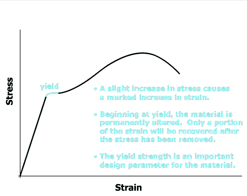
Yield Strength
Ultimate Strength and Fracture
Measures of Ductility
Review of Significant Features
scene
10
of
10